The Brief
OREH LIFE needed a brand identity that reflects its core promise: protecting lives and securing assets. The goal was to establish a presence that balances urgency and alertness with precision and care, positioning them as a trusted guardian of operations.
Brand
Vision
To become the first line of defense for individuals and organizations, ensuring operational continuity and protecting what matters most.
PROTECTION
Safety & Security
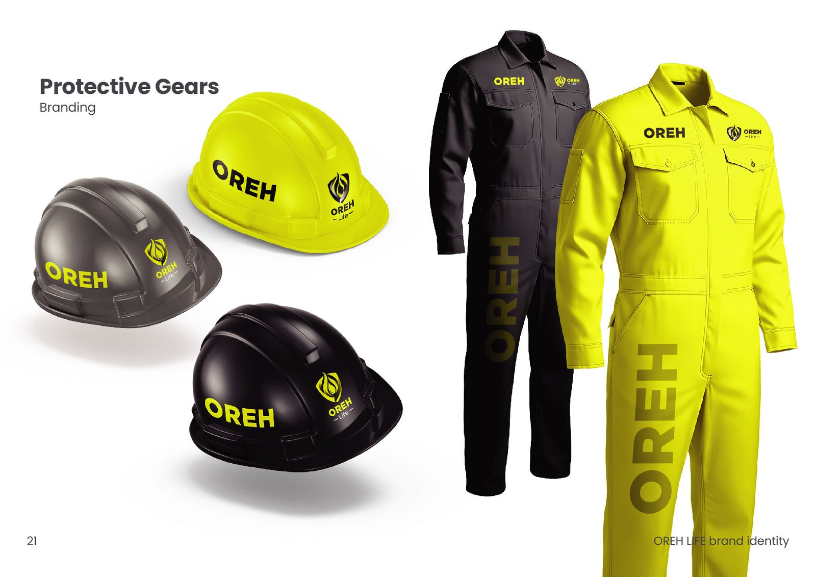 Image Placeholder
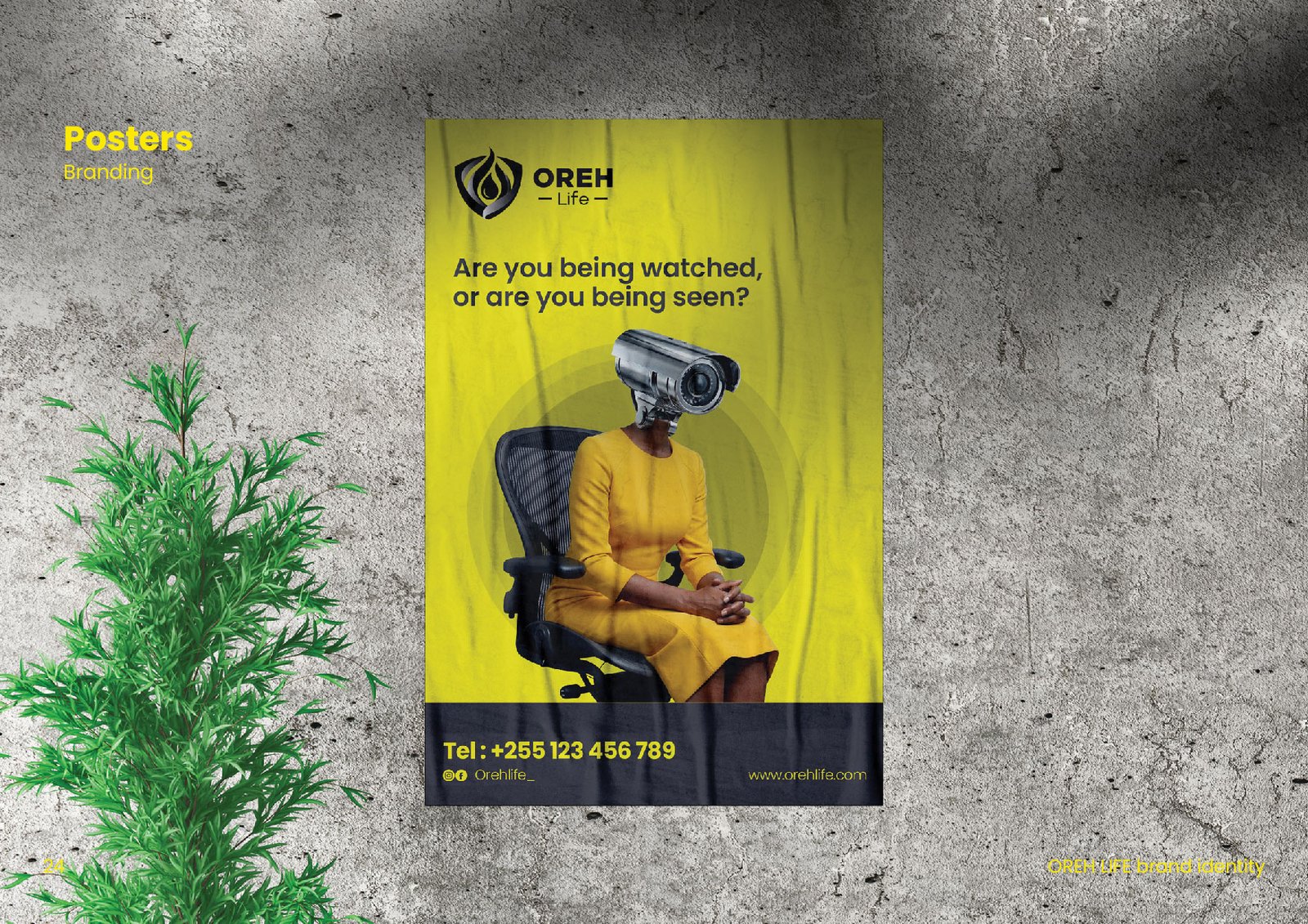 Image Placeholder
100%
Control
Management 24/7
0
Hazards
First
Challenges
- Vulnerabilities in physical security.
- Inadequate fire safety measures.
- Inefficient operational technologies.
- Risk of asset loss.
Core Values
- Protection & Security.
- Urgency & Alertness.
- Precision & Care.
- Operational Continuity.
Mission
To provide fire safety, risk management, CCTV surveillance, and ICT solutions that protect lives, secure assets, and improve operational efficiency.
Project
Outputs
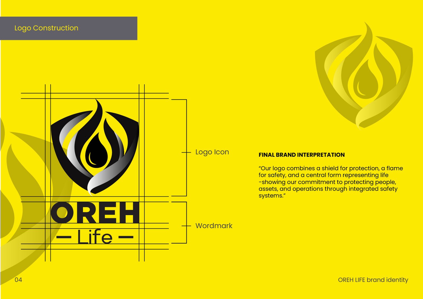
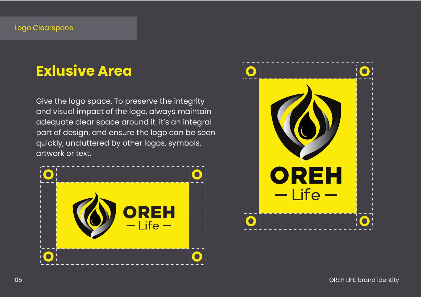
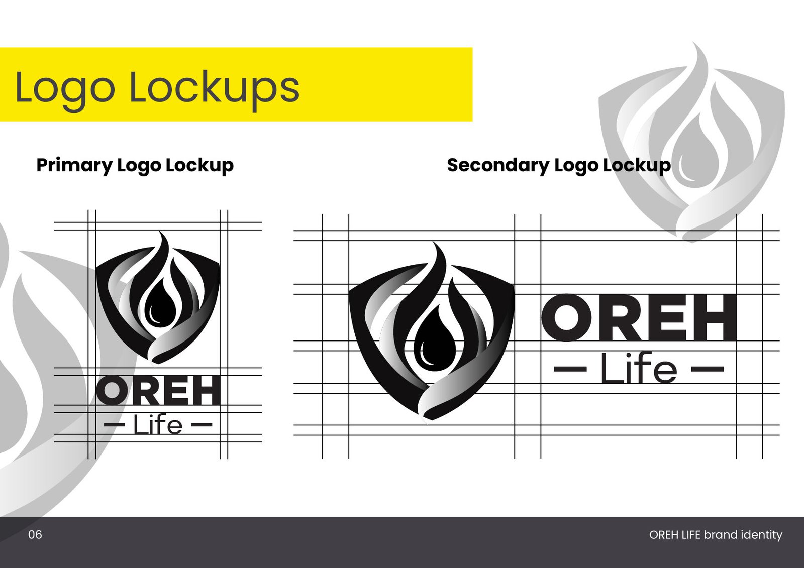
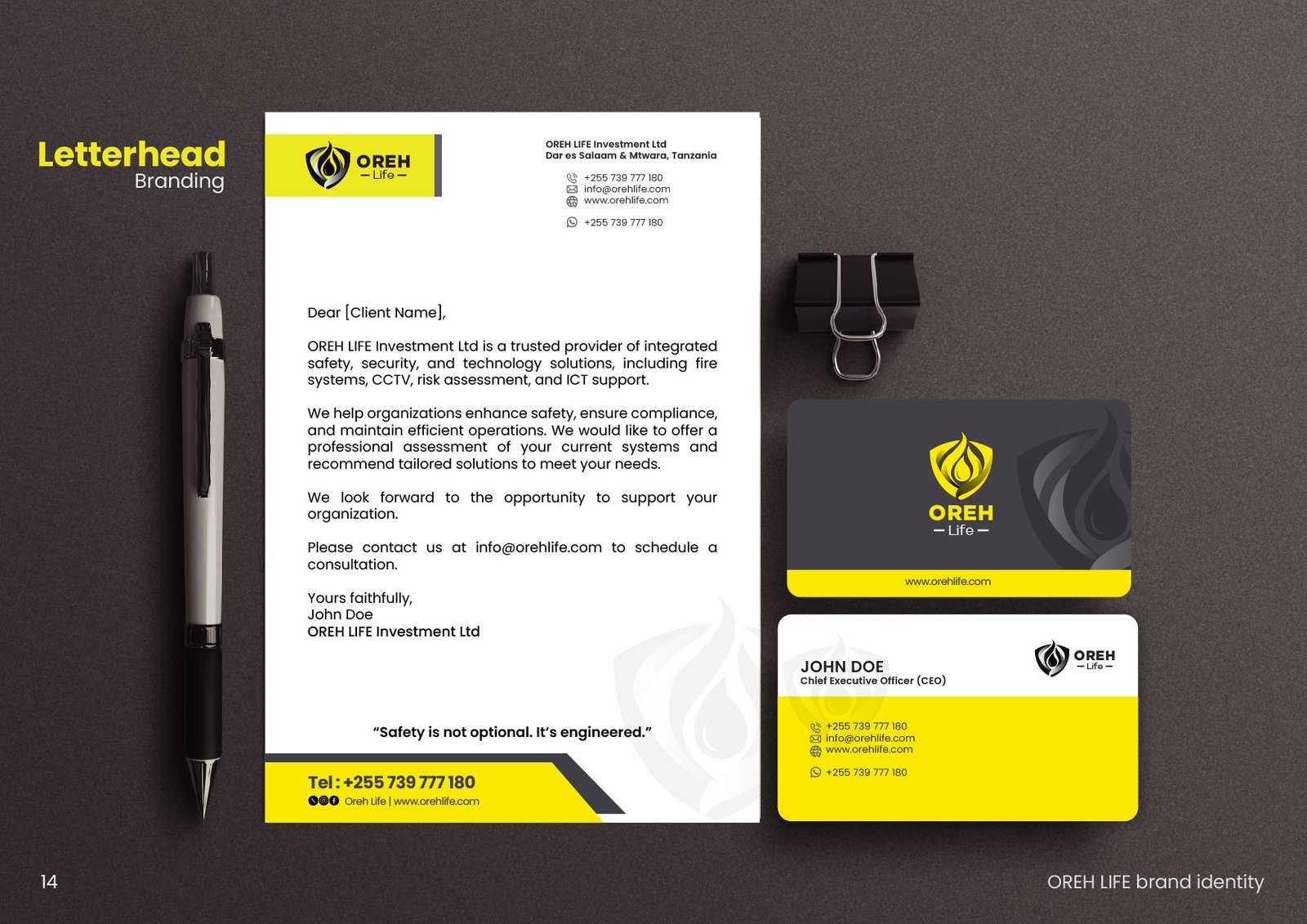
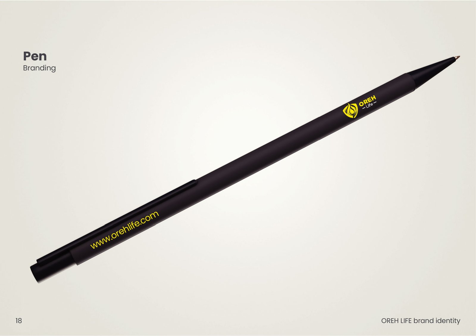
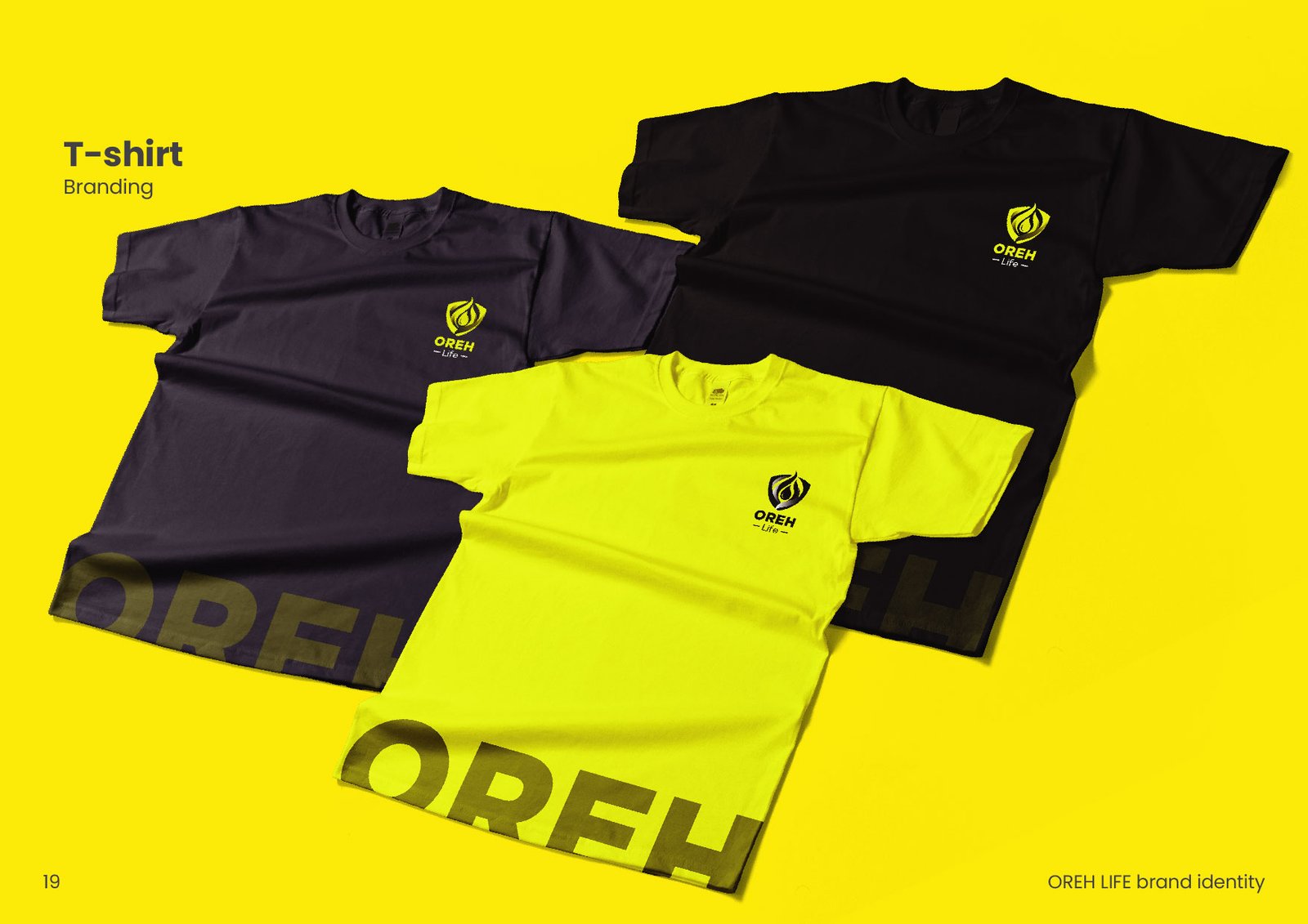
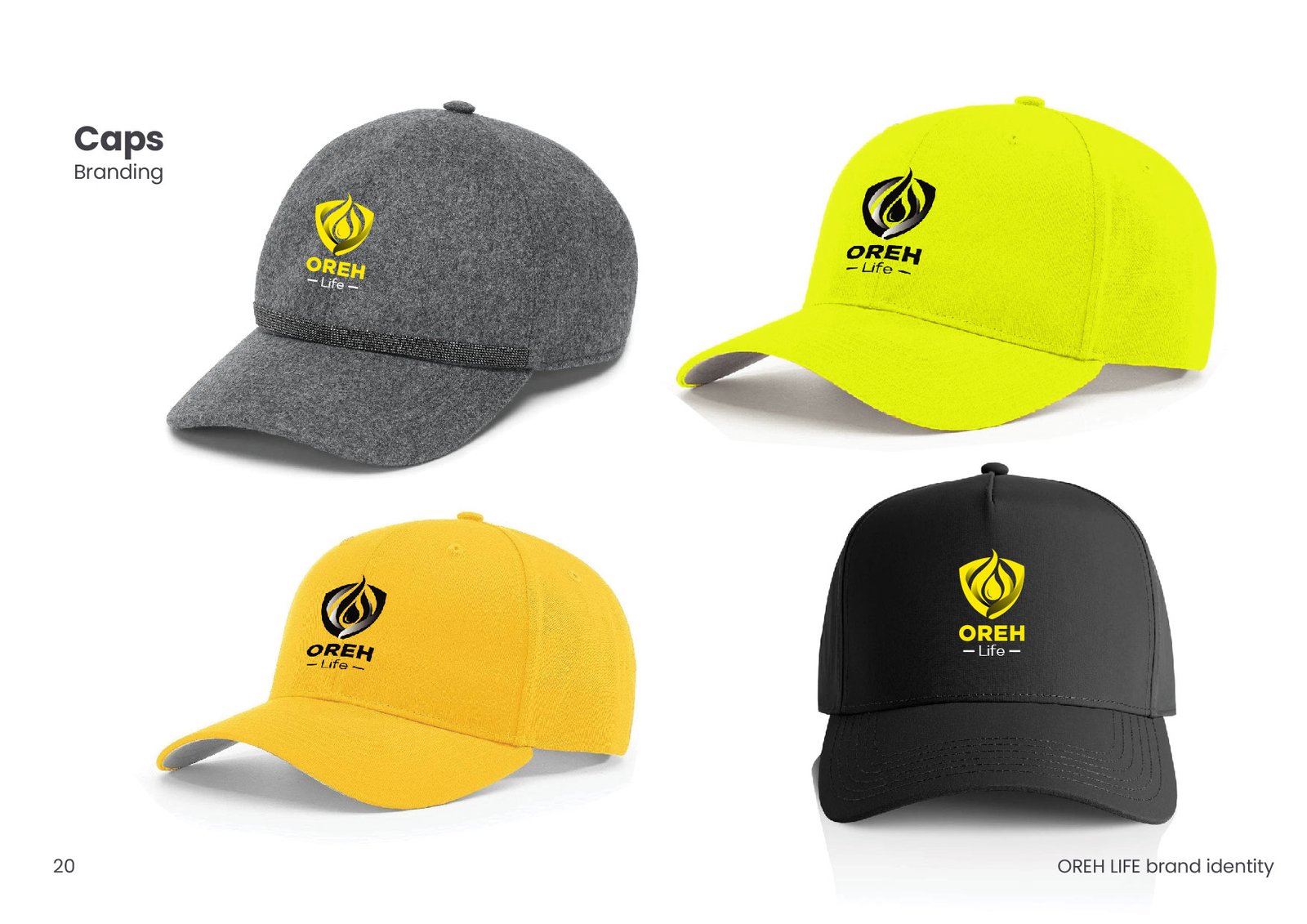
A bold brand identity combining a shield, flame, and drop. Comprehensive guidelines, striking yellow/graphite color palette, and high-impact promotional materials.
The Transformation
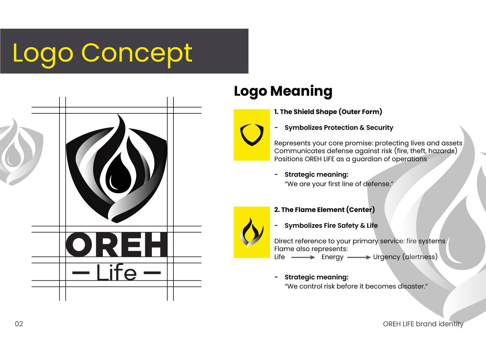
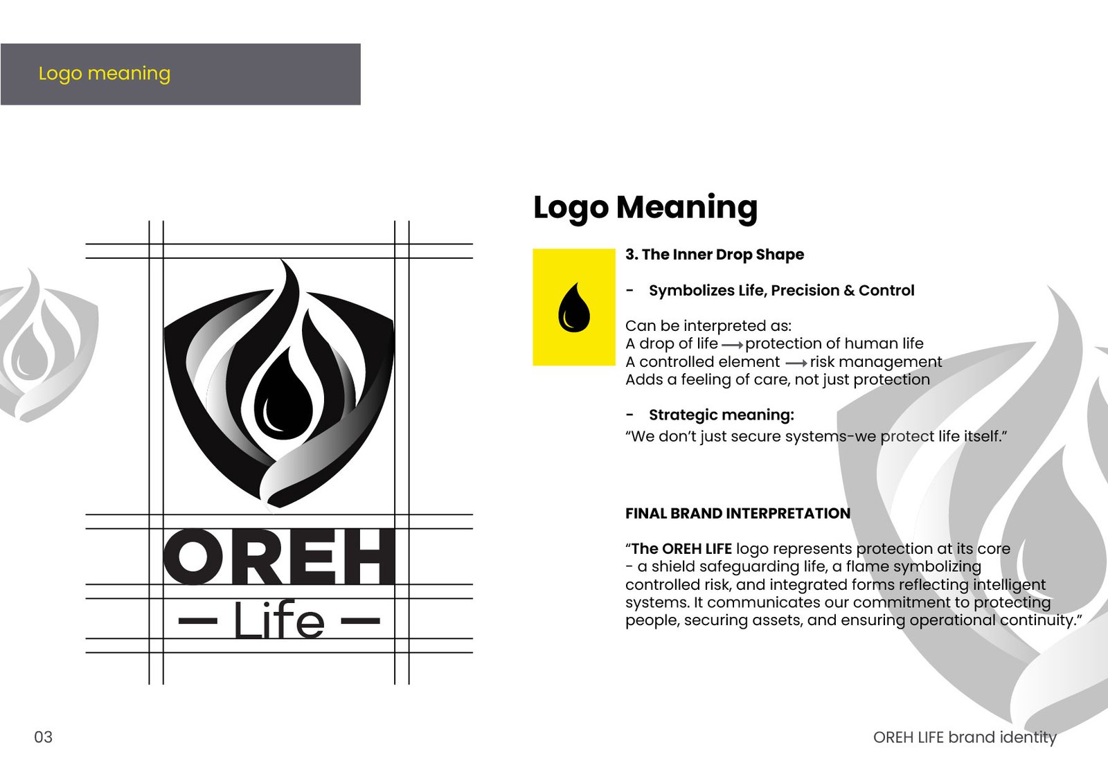
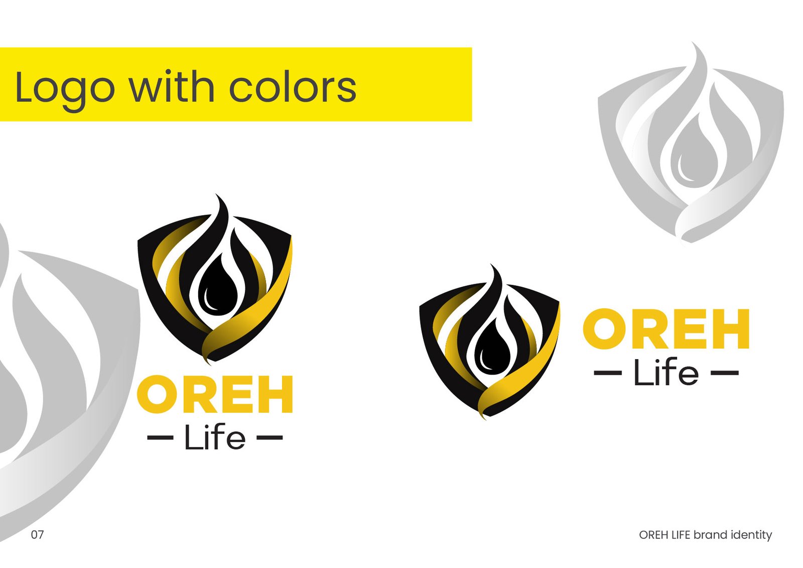
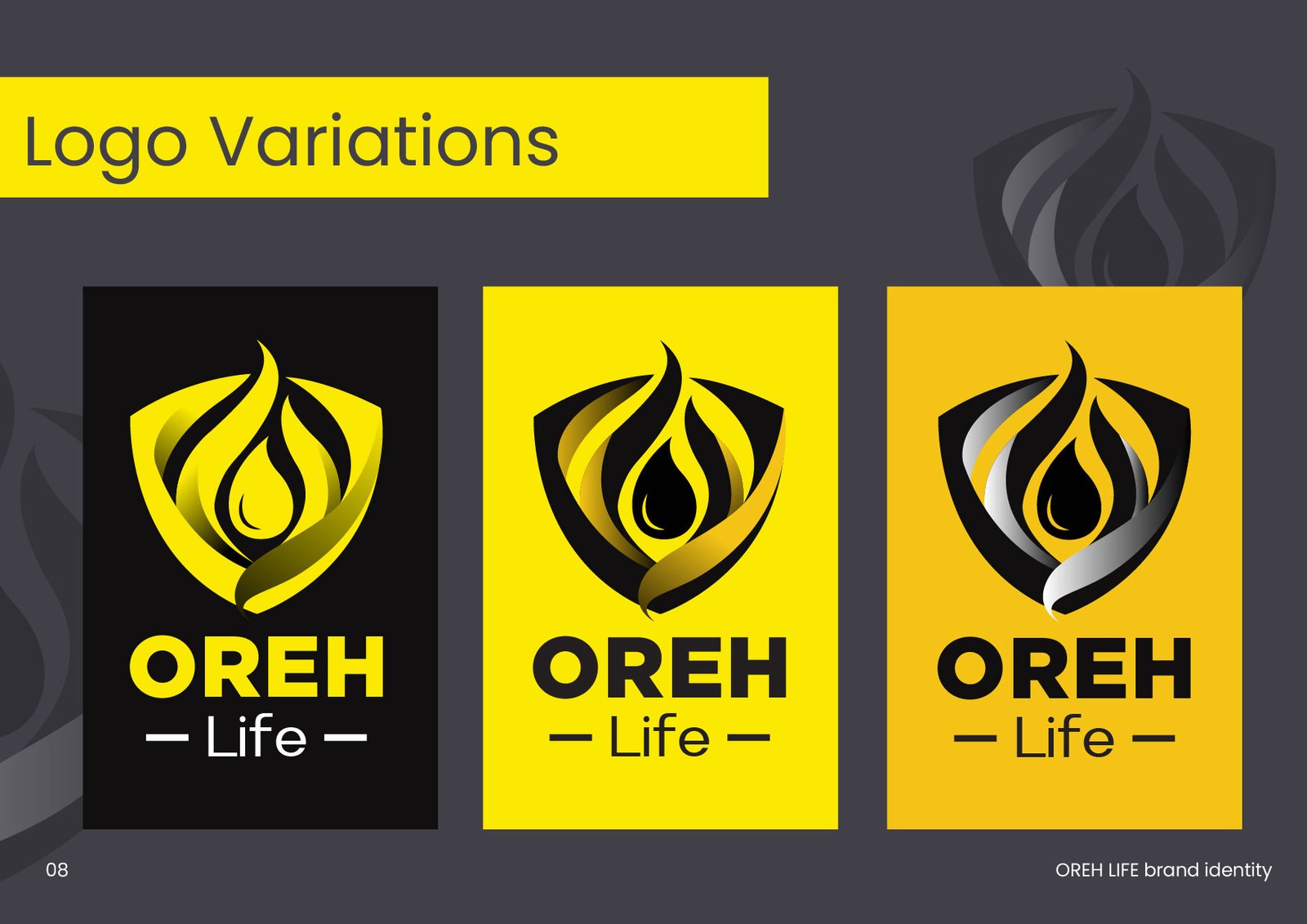
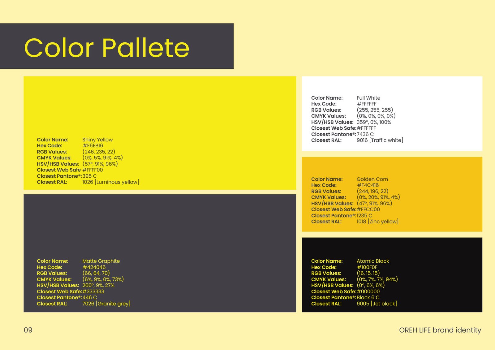
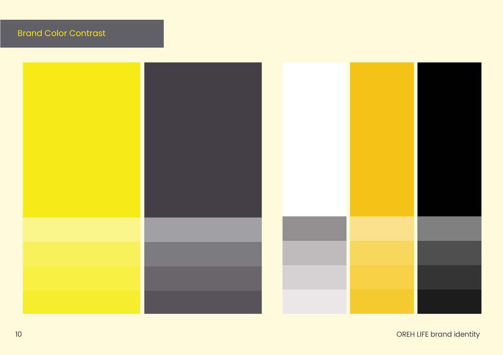
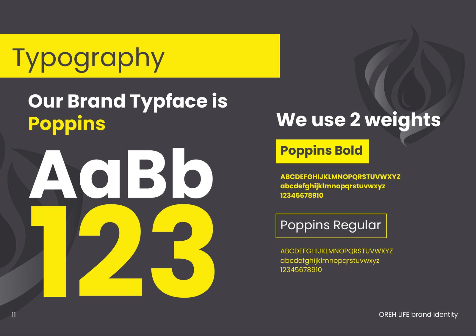
We crafted the OREH LIFE identity around the concepts of protection (the shield), safety (the flame), and life (the inner drop). Leveraging Shiny Yellow for alertness and Atomic Black for authority, the new design system communicates immediate trust and robust defense.


The Impact
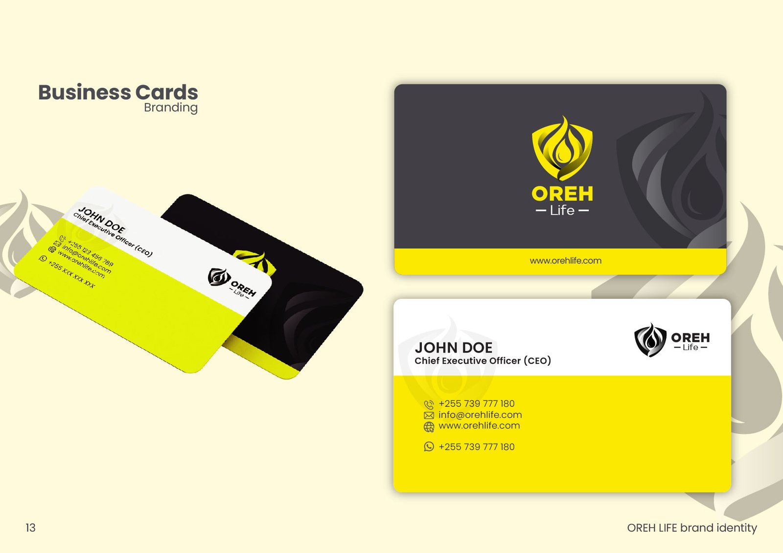
The cohesive rebrand positioned OREH LIFE as an undeniable authority in the safety and tech sector. The striking contrast of the visual language across business cards, protective gear, and social media ensures they are not just watched, but truly seen.